Let’s face it: U-Haul could use a
face-lift.
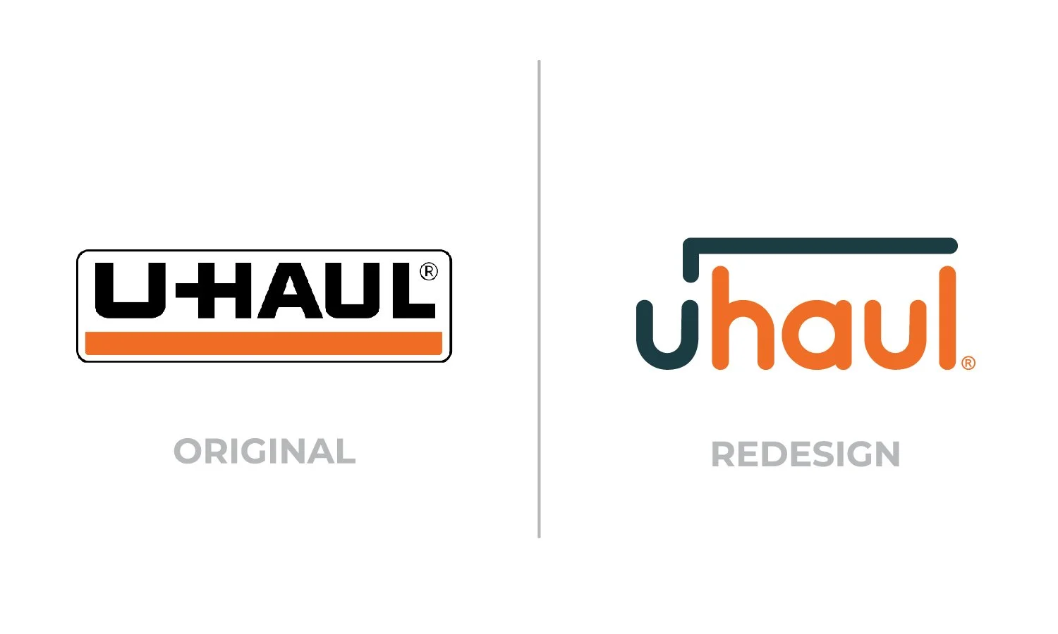
With this rebrand, I wanted to make U-Haul’s presence more sleek, modern, and clean. Something that stands out, but isn’t in your face.
I kept their trademark orange, but replaced the black with a dark blue. Then, I extended a line over the top of the text to suggest the form of the moving truck.
And hey, it won a shiny Gold Local ADDY!


